If you are here from Just add ink's, challenge page, you probably know, I posted 2 cards this week.
First here is the sketch. Go here to see the rest of the cards.
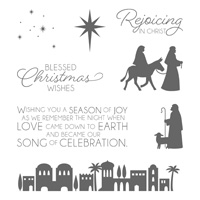
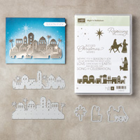
At this time of year, I start working on Christmas cards, I know it seems early, but I have fun doing the challenges to make them unlike the old days when I came up with a design and all my cards were the same. So, this first card is actually the second one. I started the one below first and couldn't come up with something I liked so I set it aside and started over.
By the time I got done with that one, ideas were swirling around in my head, so I picked up the one I had set aside and this is what came of that.
Now, I'm not sure which one I like better, how about you? Do you have a favorite? I haven't been as happy as I could be with some of the cards I've been doing lately, guess I have been in a funk with them. At any rate, thank you for stopping by to look, it's why I love posting my cards and projects.



4 comments:
Both of these cards are gorgeous Lynn! I love the blue and white colours of the first one and your black skyline and gold touches in the second are just as beautiful. It’s always a lovely feeling when the ideas flow to finish a card isn’t it :-) Thanks for sharing with us at Just Add Ink this week.
I agree - both great cards - I really like how you can have similar elements to create quite different cards. Chantell Just Add Ink
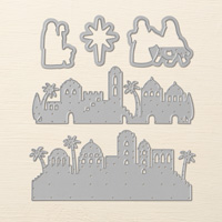
Both are great cards Lynn! I love the embossed backgrounds and the texture it adds. The die cut border on your second card really finishes it off beautifully. Thanks for joining us at Just Add Ink this week.
Both are gorgeous cards! I love how different each one is - but both are elegant and perfectly clean cards! Thanks for joining us at Just Add Ink this week!
Post a Comment