Saturday, June 29, 2019

2004 stamps meet 2019 colors, Freshly made shetches challenge #394


This weeks sketch just seemed perfect for my Christmas in (almost) July card. And being that I've been going through all my stamps lately I decided it should be a retro Christmas in July card. 
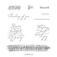
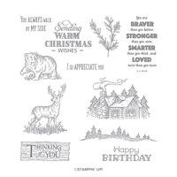
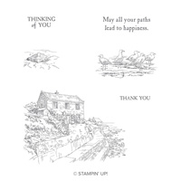
This set is from 2004.  Aren't these images so pretty? I just love this art work.  The sentiment is from Timeless Tidings which is retired, but I just love this font.  The embossing folder, who knows? It's SU but long retired, but a favorite for the holiday cards for me.
I've never sold one of my embossing folders.  I hoard them and I use them.  They are such an inexpensive way to have a fabulous card. You don't even need images over top. So many beautiful ways to color them then just put your sentiment on top and maybe a ribbon? 
All I did was layer first my Mossy Meadow CS over top of my card base that is Very Vanilla, then embossing VV piece to lay over top, then stamp and trim your image using your trimmer.  I did put a tiny piece of Merry Merlot on the top of the green strip and it's got stitching on it which really can't be seen here.
I cut my strip of green 1 3/4" and the images continue that look of layering.

I cut stamped my sentiment, then used the straight stitch piece from the Stitched Nested Label die set, twice, once top and once bottom, then trimmed close.  Added the red piece just a bit larger to it and glued it on too.
Really could be simpified, it all up to you.  

Thanks for stopping by.

Monday, June 24, 2019

A card for you, Paper Players #447


A great sketch to work with from the Paper Players challenge this week.  I took this as my chance to work with the gorgeous new Perennial Essence DSP.  This paper is sever different actually painted images made into paper. If you see it close up, you can see the canvas texture and ever single piece is stunning.   I choose this piece as it had the colors I wanted to work in today.
Here is the challenge, stop on over and see what the team has done.


My colors are: Blushing Bride, Blackberry Bliss and Whisper White.  That sweet flower cuts out with a punch that is part of the bundle for the Floral Essence stamp set.
I started with the Blushing Bride card base, then embossed the purple with the Layered Leaves EF. added the slice of DSP and wrapped the ribbon around both, then tied a little knot.
I stamped and punched out 2 of the leaves and used a glue dot to put them together.  Then stamped my sentiment and die cut using the tiny piece in the Stitched Nested Label Dies that comes with the Free as a Bird bundle.
I hope you are inspired just a bit.


Saturday, June 22, 2019

A Little lace meets Floral Essence, Just Add Ink #462


This lace die bundle was in my first order in the new catalog. And it sure has turned out to be so very versatile.  I cut it in little strips for this and glued them down to the Grapefruit Grove paper underneath.
I have had some trouble with it cutting on my Big Shot, and I have to wonder if it's because my poor machine is getting old.  I've had it 8 yrs now, being a demo and doing classes, that's a very good run. I had to shim this to get part of it to cut.  I had tried all the tricks, tilting it, turning it around, putting it on the edge on both sides, nothing else worked. So shim it is.  All the little tiny pieces fell right out when using the brush end after I shimmed it.
Here is the challenge graphic for this week. Go here to see the teams cards.

So, my colors today are, Whisper White card base, Night of Navy, Grapefruit Grove and Soft Seafoam.  After putting my lace stips down I took the piece and trimmed the grapefruit until it was the way I wanted. I just wanted that small border around.

I embossed the Night of Navy layer with the Subtle embossing folder for a bit of extra texture.  I used the Floral Essence stamps for my flower, I just stamped in Grapefruit on Grapefruit, then fussy cut the flower out. I stamped the leaves on the Soft Seafoam, then used the Leaf Punch to punch them out.  I popped up my flower after laying my leaves down and used a Faceted Gem for the center.
I didn't use a sentiment, I need a few cards I can do anything with so just in case I have a card emergency.


Tuesday, June 18, 2019

Graffiti wall, Just Add Ink #461


I don't usually give my cards a name, but this just seems like graffiti to me.  So you understand, here is this weeks challenge. And check out the teams project here:

This looks to me like a residential area in a large city like NY.  It's done in black and white except for the golden color of the tree leaves.  The brick on my card represents the brick homes. I just turned it around and did the brick in colors and the tree in Basic gray.
I choose to use Mango Melody instead of a yellow as I'm just not much of a yellow person.  And I did add Bermuda Bay.  The colors come from the new Pigment Sprinkles in this years annual catalog.
Just a word of warning, if you try them, be really sure to go very, very easy on color, then spritz.  If you still have too much and maybe too much water, take a paper towel and dab lightly in those areas and let dry. But, just put down a tiny amount  of powder.

The Brick and Morter embossing folder is one of the new ones this year and SU is using a new supplier.  So, even tho they are 3D folders, they are not as heavy as the old ones were. You may have to play a bit on your Big Shot to get it right.   I found that spritzing the CS lightly before embossing gave a better image as well.  Also, I used watercolor paper, that will make a difference as it's heaver then our CS. 

I was short on tree images that would work, so I'm sorry, this one is retired.  It's called Serene Silhouette if you want to see if you can find it.  

Thursday, June 13, 2019

Prayers and Sympathy card


Unfortunately I am getting up in years and it seems like I have to do a lot of these cards.  I just love the vintage stamps in this set, I think it lends a feel of love to it.
The main color, Seaside Blue is a new favorite of mine, it's one of the brand new incolors for the next 2 years.  The DSP is stunning and pairs to well.
This bundle comes with 2 embossing folders and 2 matching dies to cut them out with.
To check out this bundle look at the first of the bundle pages in the front of the new catalog, it's called Woven Heirlooms
Thanks for looking.

Wednesday, June 12, 2019

A Rustic Hello, Freshly Made Sketches #392


I think this brand new Brick and Mortar embossing folder is going to get a lot of use.  I love the look I got.
Today I'm playing along with Freshly Made Sketches.

Lots of things you can do with this sketch, I love that.
Besides the new brick embossing folder, I used a new stamp set called Rustic Retreat. It just spoke to me!  I think it's going to be a lot of fun, and will go all year long, even Christmas.
I used Very Vanilla CS and embossed my brink, then used a fat round brush to brush on color.  I just gently swipe it across the ink pad then onto my paper, very lightly at first, then I went back and used just the center of the brush where it pokes up, to add more color inside some of the bricks.
since it's a bit of a rustic set, I did a rustic coloring on it. Just using my blender pen (not Blends) and filled in color.
I used Terracotta Tile, Seaside blue, Mossy Meadow, Soft suede and Smoky slate.
I also used the new die set that comes with Free as a bird.  A larger one for m y graphic then a smaller one for my little sentiment.
I also used the tiny sentiment die from the Stitched Label dies for the little flag pieces.
I hope you enjoy.

Friday, June 7, 2019

Butterflies and flowers, Freshly Made Sketches#391


I decided to start my card to day with one of the new incolors. Pretty Peacock.  I added in some Mango Melody and Old Olive as well.  To my mind there isn't a better embossing folder anywhere then this Country Floral.   It's just so perfect. It's so elegant just embossed in white, or just plain pretty done in a color, or it can take over for a designer series paper like I've done here.
I'm playing along with the FMS challenge this week as well. Check out the projects from the team and everyone one else here.


I used my sponge daubers and ink pads to get color on the embossed image. Cut my pieces and layered them, then layered it all onto a Mango Melody, Subtle embossed panel.
Stamped my Butterflies from Butterfly Gala, cut them out using the punch and added them using dimentionals.  I then added my sentiment using a white piece then adding it onto a piece of Pretty Peacock.   Not hard at all, but I do love all the texture.

Thanks for stopping by.


Tuesday, June 4, 2019

Ocean view, Paper Players #444.


I've had this set for quite awhile and hadn't used it, although I really love it.  It just seemed to be perfect for this challenge, so I played until I got something I liked.  The stamp set is By The Bay.  The birds are from High Tide.
Here is the challenge, check it out and see if you might want to join in. 
Much of my life I lived in the Bay Area of CA.  Born in LA, I grew up all along the coast, ending up in San Francisco where I went to High school and gave birth to  2 of my 3 girls. After that we left the state.  But this graphic just brings all that back.  Also makes me very sad for what CA has turned into.

I used the new incolor Seaside Blue and Terracotta Tile for my larger building.  They did a great job of making it what I thought it should be. An old, old ocean side building that has faded.  I really enjoyed the coloring I did on this, I used my Aqua Painter, picking up color from my ink pad and laying it into the lid while mixing some water with it to get the effect I wanted.  This called for very light, soft colors.
The greenery at the side is colored with Soft Seafoam and the concrete walls and walkway are Smoky Slate.   My sky is Pool Party. 

I did all my work on what would be my circle first, cut it using the Stitched Shapes Framelits, then put down the same stamped image on my white card layer, also stamping the birds in the water.    I put the circle down leaving just the black stamped imaging showing under it.   It just needed something more, so I pulled out High Tide and stamped the sea gulls over head.

I hope you like it and maybe just take a bit of inspiration away.


Saturday, June 1, 2019

A Blissful future, Just add ink #459


I'm playing along today with Just add ink for their color challenge.  At first look you wouldn't think these colors would go together would you? I thought this would be hard, but once I got started it wasn't too difficult. I have thought after the fact of a couple things I might have done extra, but it's pretty busy as is.
Here is the challenge and link to the site so you can see all the cards.


I keep reaching for this stamp set, the bundle comes with a punch for the one flower in the set I didn't use, so there is lots to play with.   It's Floral Essence, in the new catalog going live on June 4th.  Really soon now. 
I love those tiny red rhinstones that came out in the Holiday catalog and are still in the new annual one if you are wondering. They were just the right little bit of bling.

I used the Stitched Nested Label dies that come in a bundle with Free as a Bird also in the new catalog.  I just love these dies.  I stamped my flowers and then laid the die so the end hung off and created a flat side, otherwise it's the same on both ends.

I hope you enjoyed, I love if I can inspire you.