

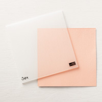
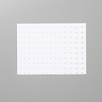
If you've seen the new catalog, you know there is an embossing folder called Subtle. It's impossible to see what it looks like, so having just gotten mine, I set out to see what I could do about that.
One of my favorite things to do with my embossing folders is use my hard rubber brayer over an ink pad and then onto my folder.
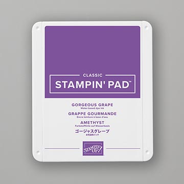
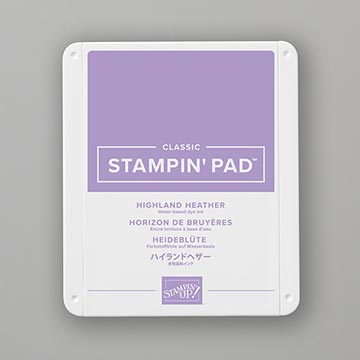
You can pick a side or just do both and see which one you like better. This is the folder using the Highland Heather ink. It reminds me of those glass shower doors that have what the companies seem to call rain. I really like this. I'll be doing lots more playing with this idea. For instance, what would it look like if I put the darker Purple, Gorgeous Grape over the lighter CS. Hmmmmmmm.
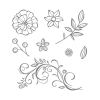
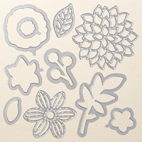
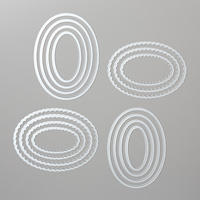
The aqua is Costal Cabana, a returning color, we had it before as an incolor. White and Highland Heather, Gorgeous Grape and I used the Falling Fowers and May Flower Framelits for my ovals and of course Basic pearls.
No comments:
Post a Comment