Thursday, July 28, 2016

Pals Paper Arts challenge #311, Small things


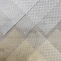
It's my week! How about that. I love serving on the PPA team more then I can tell you. It's fun, it makes me want to do my best work and it pushes me to try new things.   So, here are the colors I have selected for my week.


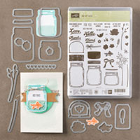
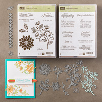
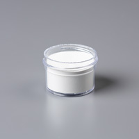
It is so hard to choose a favorite new set/bundle in this years annual catalog! I have never seen such a fabulous catalog in all the years I have been buying Stampin Up.   I did think Swirly Birds was my fav, but this jar set is so neat. So many different things you can do with a killer stamp set and die set.

Then there are the flourish sets, but that is another day and card. LOL

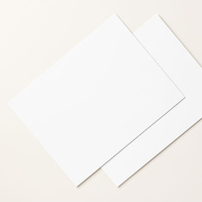
This is the medium sized jar in the stamp set, there is a little stamp for the water or whatever you want in there, but I enjoy watercoloring my own in.  I used the Shimmer White paper as you can do some watercoloring on it without problems.

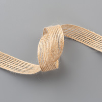
Since I always seem to leave a mess behind, I have left one on the bottom of the card. Some leaves and flowers just fell out.  And I love the bow on the jar.

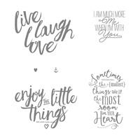
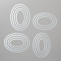
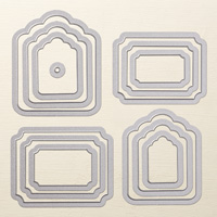
The sentiment is from Layering Love. It's so nice to have a set with large and sometimes more meaning ful sentiments.  I used the new Layering Ovals that I just got.  I LOVE these layering shape sets, all of them.  I think this card would make a great new baby shower card, what about you?

Not that anyone in my family is having any more babies anytime soon.  I have 6 grandsons, 3 are old enough they could have kids, but they do not.

I do hope you have enjoyed and I have left behind a bit of inspiration.  If so that makes me very happy because so many blogs have given me plenty.

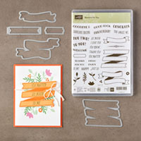
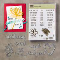
If you would like to purchase or just check these out further, please click on any image below.


Tuesday, July 26, 2016

Stampin Up, GDP#045, Gold Foil and Flourishes


I appologize for the photo, every once in a while I just can't seem to get the lighting right for a certain card. Sure happened here. But it is a beautiful card.

Elegant Eggplant and Sweet Sugarplum.  Those new incolor are sure easy to use and mix in with so many of the colors in the sets we already have. 

This gold foil has acetate sheets with 3 different patterns on them.  This was the simple one, the other two are even more beautiful, but would have been too much for using the flourish.

The Hello and frame are a part of the Banners for you set.  It goes from this tiny one to the big 3 tier one.  It's a fabulous bundle.

Todays GDP is a sketch challenge:
Hop on over to the GDP page at the link above and check it out.


Monday, July 25, 2016

Sunshine Wishes Meets Jar of Love


This was a card I did for my class, my inspiration for it came from a card shown in  my Stampin Pretty group by Demo Su Mohr.  I'm pretty pleased with how it came out and my class seemed to have a good time making it.

The hearts of course are from Sunshine Wishes thinlits dies.  The matching stamp set is Sunshine Sayings. A whole big bunch of sentiments that you can use alone or mix and match.

Colors on this are:
Watermelon Wonder, Blushing Bride, Mint Macaron, Delightful Dijon, Crushed Curry and Tip Top Taupe.

After using 5 different embossing folders on pieces of Whisper white, I cut some strips for the center at 1/2" and the rest at 3/4". I started in the middle with the 1/2" strip, then did the outsidse edges and then added in the 2 strips on either side of center.

All the flowers are from Jar of Love, it has several 2 step stamps for the darker inside.

I hope you enjoyed and got inspired just a bit.  Happy Stamping.


Friday, July 22, 2016

Pals Paper Arts Sketch challenge #310, Make a Wish


We have a very different sketch challenge today, some people hit it right off, but it  took some thinking on my part for this one.
Here is the sketch.


What do you think? Easy?
The very first time I saw the new incolor Sweet Sugarplum close to my Rich Razzleberry, I knew they were the same color, Sweet Sugarplum is just a much lighter shade.  If youi look at my flowers you will probably think 2 are the same color, but they aren't. I have one of each, and they are done on Watercolor paper.  I love using my Aqua Brush, you can get so many more effects the with a marker.  See how some areas are lighter and some darker?  That is the look I love.

I'm kinda a bit of a control freak.  So, this suits me.  I used the little stamp in Timeless Textures for the splatter. To get this look for my flowers, I embossed the flowers in white, then colored in as I have said. The Bitty Butterfly is out of a piece of the Playful Palette DSP stack. I sure hope you enjoy.

If you would like to purchase, please just click on any graphic below.


Monday, July 18, 2016

Global design Project color Challenge #045


One of the really popular sets in the new 2016 annual catalog is Flourishing Phrases.  I used a tiny part of it on here. There are several gorgeous thinlits, and the stamp set has a ton of neat sentiments and some great stamp images as well.

Here I cut 2 of the little leaves and 1 each of 2 dies and put them together.
Here are the colors for this week.


I decided that the Melon Mambo had to pop off the black, and the Smoky Slate is in the middle of the sandwich.
That said, I had a terrible time editing this photo so the colors were right. Sometimes it is just really hard.  The sentiment is stamped onto Smoky Slate even tho it looks more white. And I have to appologize, but the ribbon I used is retired. I just didn't have a piece that was right otherwise.

I love this sentiment.  It is so all purpose and can be used for all kinds of reasons.

Thank you so much for looking.
Click on any image below to place an order.

Thursday, July 14, 2016

Stampin Up, Pals Paper Arts challenge #309, Just a Note


Welcome to my blog and the latest PPA challenge. This week our featured artist is Katy McGloin. Such pretty colors she has picked.   I have not used this new incolor much yet, it sure turned out pretty.  Here is Katy's colors for this week.


As you can probably tell I embossed my flourish, but then instead of sponging I did something different. It's a subtle difference but I like it better.   I used a round (mop) brush, a big one, brushed it lightly over my ink pad and then on my paper. You do that repeatedly until you have the color you want.

Then I used the grungy dots, I started with my Whisper white ink pad hoping I would get white over my color.  But that didn't happen.   I do love what happened instead, the dots with white turned to sugarplum, but a bit darker.  I also added just a few Island Indigo dots.

I am loving the Tags and labels set, it did a great job here for my sentiment. Then I cut the border in the flourish set and added my ribbon on top for a subtle effect.

Thanks for checking out my project for this week!


Monday, July 11, 2016

Comfort and Healing


I decided to do the GDP 044 challenge today.  I fell in love with the card to be CASE'd.


So soft and pretty. My favorite part is the gold butterfly, so I used the Flourishing  Phrases bundle and cut out my flourish from gold foil.  Anytime you use the gold foil it just makes for such a gorgeous card.

I did a very light sponging of soft sky on the card, it's very hard to see, but in person it shows up great, just really soft.  I also added some gold splatters and the sentiment.    I also used Timeless Textures to add some texture to it, just hints here and there.

Thanks for coming by and looking.  If you would like to see the product used closer, just click on one of the graphics below. You can also order from me using those.  And if you would like to have a catalog so you can check out more samples and possibly buy more just let me know.