Thursday, March 31, 2016

Stampin Up, Pals Paper Arts Challenge #294


This week is a sketch challenge hosted by Dawn Tidd.  I usually do not use a great deal of DSP, (Designer Series Paper).  I find often that people rely on it too much.  I truly enjoy coming up with my own design.  So, this is a departure for me and I love it, these two pieces worked so well together.

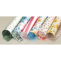
The DSP is English Garden and it mimics a stamp and die set we have as well, so the possibilities are endless.  Often times SU will take some color and when they used them for DSP they will lighten them up as is the case here.  The pink in this is Melon Mambo and that is the color of my ribbon.

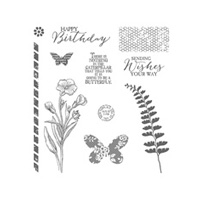
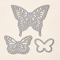
For the center I used two ovals from the Oval framelits and my butterfly is from Butterfly Basics stamp set, die cut using the Butterfly thinlits.  I then sponged color (Blushing Bride) on the edges so I didn't have that white border.

I hope you enjoyed and gained a bit of inspiration here today. Thanks for stopping by.  Here is the sketch:

Come on over and play with us.

Tuesday, March 29, 2016

Stampin Up, Global Design Project challenge #029


This week is a color challenge.  I love that GDP has several different types of challenges,  It's always fun to see what's going on for this week.

Also, you can't find a group of better card artists anywhere, some of the best of SU's demo's play here, some as team members and some as players.  Some are even on the Stampin Up Artisian team.

We have 3 bright/dark colors today, that can be a little difficult, but using  a lot of white space helps. I thought about making my Happy die cut in the Bermuda Bay or Tangelo Twist, and in my head it just wasn't as nice, so hopefully it shows up ok.

The Gorgeous Grunge set was my friend here.  It gave me that watercolor drops look I was after with a lot less stress.   For me, when I try splatters and drops, I end up a mess! LOL, I'm kind of a messy stamper anyway. Here are the colors.


I hope I have helped to give you a bit of inspiration here.  Thanks for stopping by.


Thursday, March 24, 2016

Stampin Up, Pals Paper Arts color Challenge #293


So, as you already know, this week is a color challenge. I'm on the team that does color challenges.  This weeks are 3 beautiful colors, :

Here they are.  My base card is So Saffron and I put a layer on top of the So Saffron DSP Subtles Stack. I love the stacks, and this year they redid them to make them even better.  Beautiful patterns. If you only can buy one, buy the Neutrals stack! Besides being so usable because they are neutrals,  and also because of the gorgeous patterns.

Choose Happiness is such a great stamp set. I think it doesn't look all that impressive in the catalog, but I have used it so often.  I also used Timeless Treasures from the Occasions catalog.  I lightly stamped a few of the flower as well as some texture then stamped 2 of the flowers to put on the top.

The center is some of the really small Basic Pearls.

If you are wondering where my sentiments went, well, one of my daughters has asked for cards with no sentiment so she can add her own use, so I am working on that. It can be so hard to do when you often base a card on the sentiment.

Thanks for stopping by, and if you haven't already, stop on by the challenge and see what the rest of the team has done.


Thursday, March 17, 2016

Stampin Up, Pals Paper Arts Sketch challenge #292


The PPA challenge this week is a sketch challenge, an awesome one with lots of layers to play with.
I took my inspiration from  featured Designer Beth Beards sketch and the card she did using it.
The top colors look a bit more washed out then the bottom, I think I had the light a little to strong on the top of the card today.  

The colors are Whisper White and Marina Mist, with Organiza Ribbon in white.

I also used, The Subtles DSP Pack, Water Color Wings stamps, Butterfly Thinlits dies, basic pearls,
the 2" circle punch, 2 3/8" scallop circle punch, and the Butterfly embossing folder. 
Here is the sketch:

I hope I've been able to give you a bit of inspiration. Come on over to PPA and play with us! Either click on the link on the right side bar, or CLICK HERE.

Have a wonderful Easter!


Thursday, March 10, 2016

Stampin Up, Pals Paper Arts Challenge #291

And it's a color challenge this week.  
I pulled out the stamp pads for these colors and just kept staring at them. I had 0 ideas in my head. I ended up just pulling down stamps and adding to my little scene one thing at a time.   Usually I have some idea in my head before I start putting down ink to paper, not this time.

I used one of the Notecards.  You can get them in Whisper white and Crumb Cake, 20 cards to a set with their own envelopes.  They are 3 1/2" x 5" and if filling up a full sized A2 card is a problem for you, this size works very well with less. 

I started with the grass, it's a stamp in the Work of Art stamp set in the Annual Catalog. The flower stamp has 3 flowers with stems and comes from Sprinkles of Life.  BTW, if you love this set and don't have it, you might want to buy it soon.  It's the Ronald McDonald house set and is replaced each year. A portion of the price goes to Ronald McDonald house.

I just stamped it over and over, added the clouds and sponged on some sky color.   I only used the little bird on the Tree builder punch, but I could have punched out the tree and the leaves as well.

I also used the Envelope Liner die for the inside of the envelope. 
I hope I have inspired you a bit.  But come on over and see the rest of the Teams work at the PPA site.

Here is this weeks colors:


Monday, March 7, 2016

Stampin Up, Mojo Monday #438


I decided to play along with Mojo monday today.  Ideas came pretty quickly for this weeks sketch.  Every once in a while one has to make something that doesn't have flowers, right?  I do so love flowers.

It also helps to have a masculine card or two laying around.  I left the sentiment off this one so that I could add one later depending on what I used it for.  I have to admit that I almost put the circle sentiment from Going Global on it tho, it would have fit right in.

I used a combo of Going Global stamps and The Open Sea stamps, both have a globe, but they are different, both have the compass, but they are different. The one I used is larger and I cut away the rest of the round compass parts and just left the direction pieces.

Colors I used:
Black, Very Vanilla, Delightful Dijon, Also used Black embossing powder and the Versamark ink pad.
Here is the sketch for this week.

Thanks for stopping by.

Friday, March 4, 2016

Stampin Up, Easter Watercolor card

I was making cards for my upcoming class and my brain just took off on it's own. This was the result.
I am working on doing watercolor, but I'm not very good at it!   I made 4 different watercolor pieces and this was my favorite.

After my watercolor dried, I stamped on it with our Archival black ink.  Best to use that or Staz-on so it doesn't run or cause the colors to run. Not too much of a risk here even if I used Memento, but just in case.  I love how the florishes have that same look as the design in Timeless Textures.  The texture in the watercolor paper caused that. 

Then I cut each strip. I made them 1 1/4" high x the width of my yellow.  The hello is from A Dozen Thoughts, and I used this little sentiment because I have the big Easter one inside from Suite Sayings.

I topped it off with flowers from Botanical Builder Framelits dies.

Feel free to CASE ( Copy and share everything) it's just what we do.   If you post yours, it would be very nice if you linked back to give me credit.  Thanks.  

My colors were:  Rich Razzelberry, Lost Lagoon, Hello Honey.

Thursday, March 3, 2016

Stampin Up, Pals Paper arts challenge #290

This week is a sketch challenge, come along and join us.  Looks like many of you are, and I'm so glad to see that.

I've been wanting to use the Timeless Treasures stamp set and this seemed like a great time to do so. It's a little hard to see, but I stamped in Daffodil Delight on the same color paper as well as using the Tip Top Taupe Image. 

I used both the Bold Butterfly framelit and the Butterfly Thinlit.  One cut out the intricut butterfly, then I used vellum to cut the framelit butterfly and put that over the top.  Then I added the pearls for good measure.  I love how it turned out.

The green is Mint Macaron. Remember, these incolors are retiring May 31st, so be sure you have everything you need. Extra paper, refills and all the pads, they go really fast toward the end.

I used a small piece of Pretty Petals DSP paper stack to cut out my butterfly, the vellum did a very nice job over the top.

That is Mint Macaron lace ribbon on the edge and I used the Word Window over the top of the small oval punch. 

The Happy Easter is from Teeny Tiny Wishes.

Thanks for stopping by and I hope I have inspired you just a bit.